East Park Naturals Brand Identity
The Challenge
East Park Naturals is a company with a 25-year history in developing natural supplements. They wanted a refreshed brand identity that positioned them to their new audience as the trust-worthy experts that they are.
The Solution
As a brand with a rich history and dedication to natural healing, it was important that East Park Naturals brand identity be one that reflects the naturalistic and organic aspects of their products.
The seal
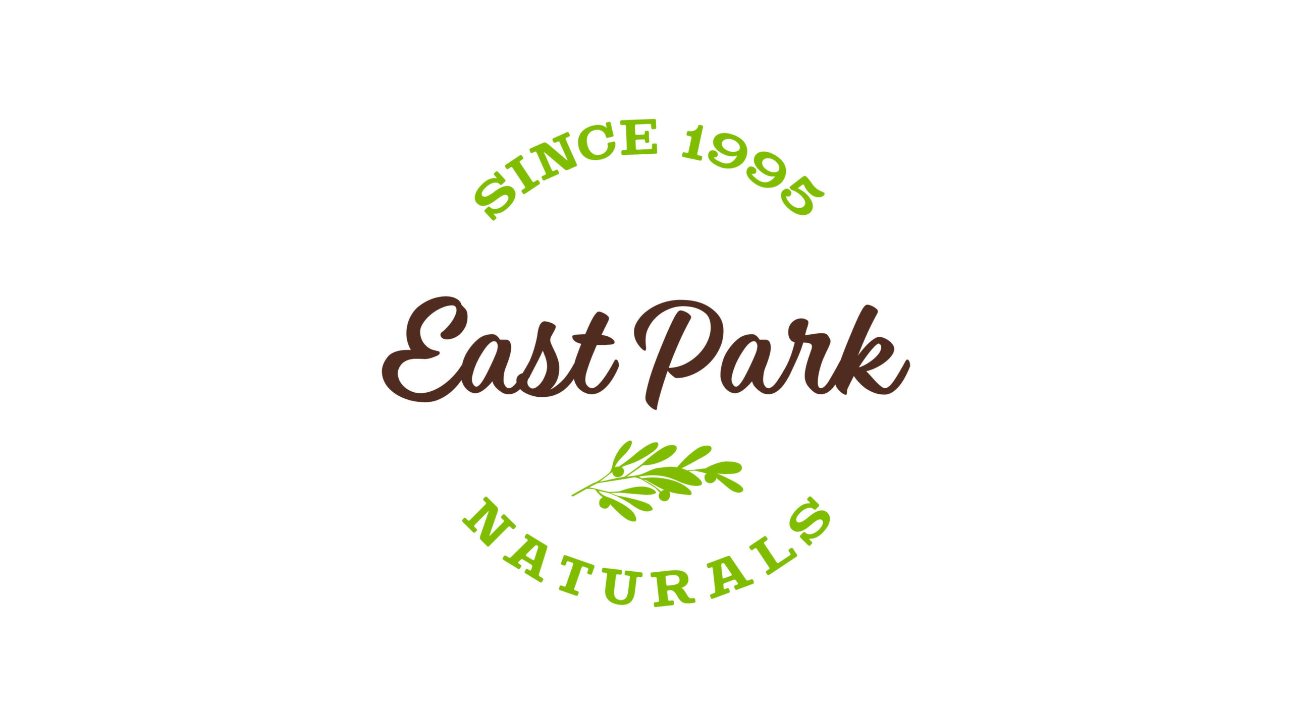
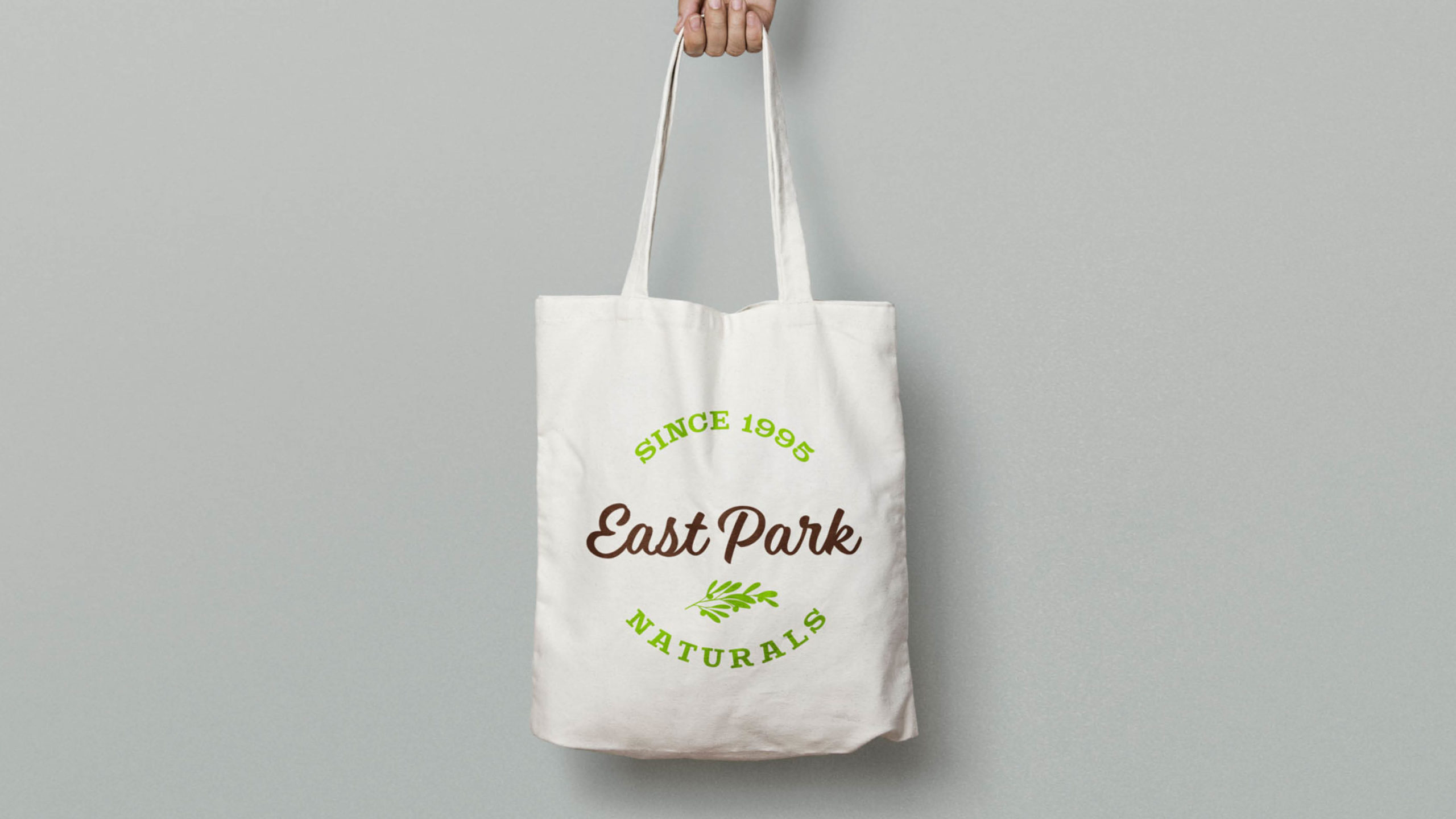
The design of the logo intentionally forms a seal. This shape not only evokes feelings of trustworthiness, but it also gives us the opportunity to include the year East Park Naturals was founded.
Colors that matter
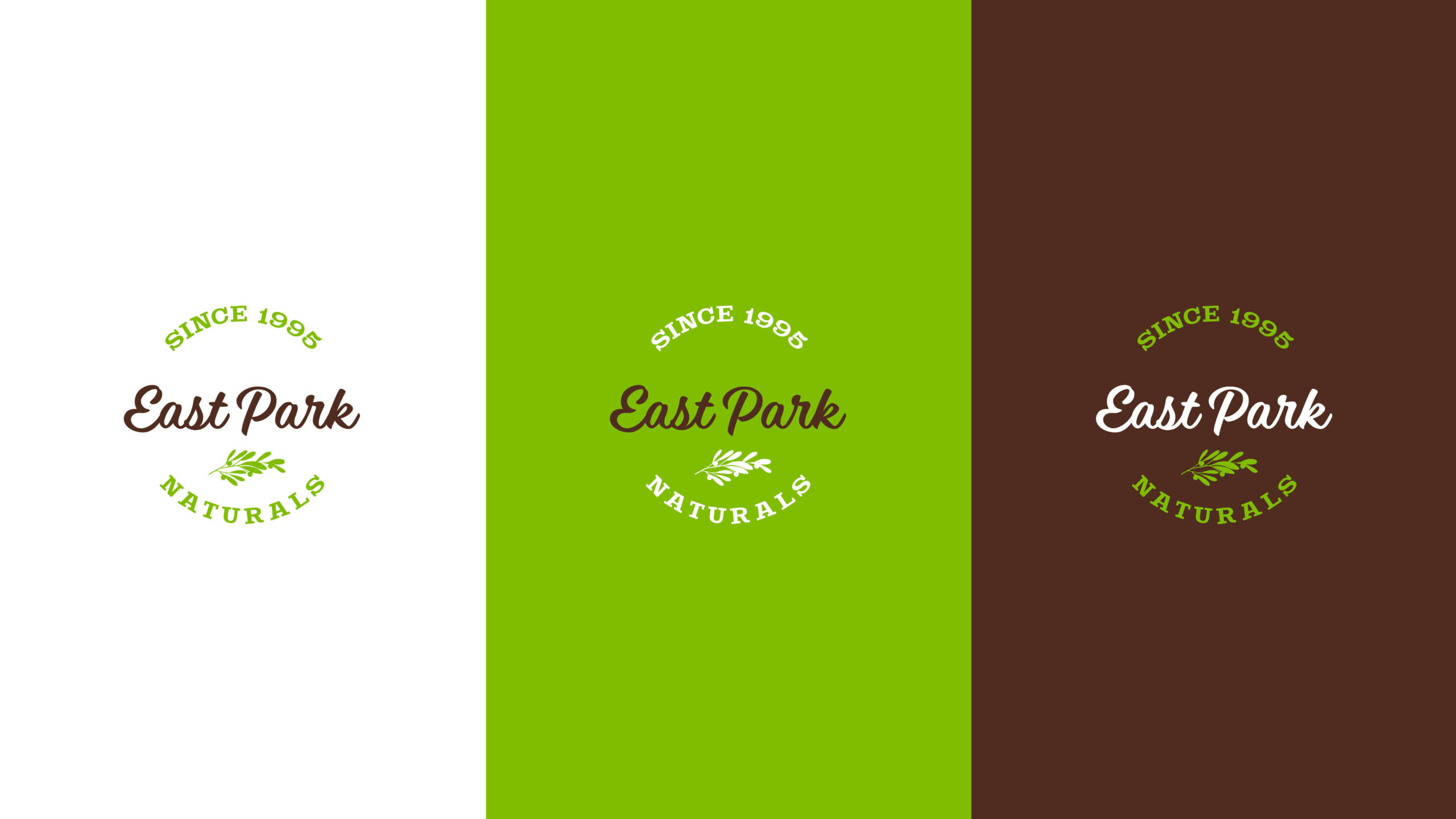
We wanted to visually reinforce East Park Naturals’ positioning as an all-natural company by utilizing a color scheme that represented that.
Green symbolizes nature, the olive leaf, and the promise that their products will always remain natural. Brown symbolizes the earth, and planting the seed for a better tomorrow.
We deliberately chose tones of green and brown that would contrast well with each other. This let us create 2-color versions of the logo when using either the green or brown as a background.
Visualizing the brand

Shaping and explaining

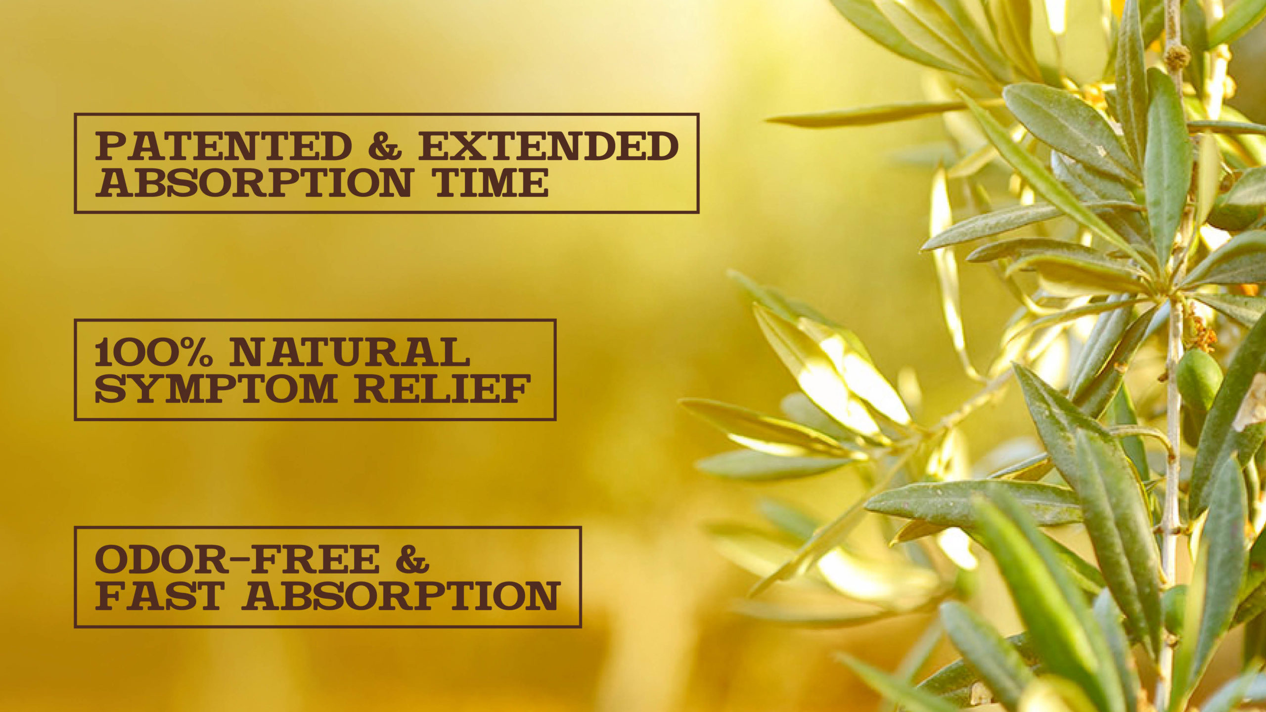
The brand promise
East Park Naturals’ new brand
East Park Naturals launched their in-store brand. As part of the launch, we created the new brand identity, packaging, marketing materials, in-store displays and much more. You’ve seen one part of it here, check out the other case studies below.

Creating a natural lifestyle
East Park Naturals is a research-based, natural vitamin and supplement company with a mission to heal naturally and change lives.
President: Geoff Melcher
VP Sales: Mike Shelton
Design & Strategy: Bear Double
Website: EastParkNaturals.com
Ready to start growing your business?
Related Projects
