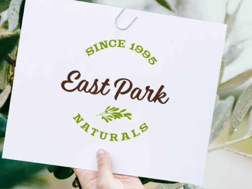
East Park Naturals Packaging Design
The Challenge
East Park Naturals is an organic supplement company. They were in the process of launching their products in stores and needed a look to connect with that audience.
The Solution
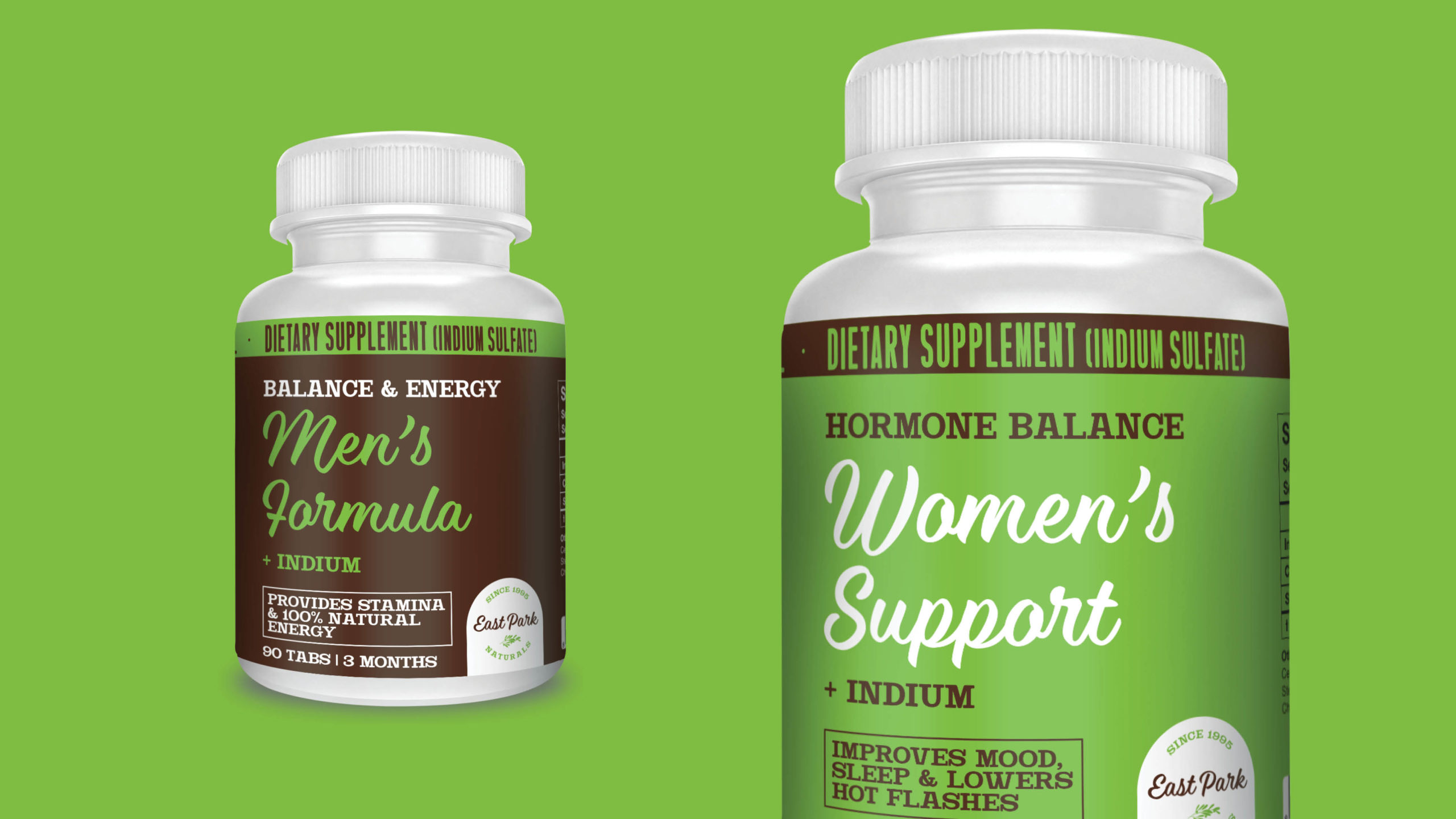
With a product line that was bound to launch in retail stores, it was important their packaging clearly indicates what the product and its benefits are. We maximized the space for the product names and set a well-defined visual hierarchy for the remainder of the information.
Legible and to the point
While a lot can be said in a supplement label, the most important design factor was legibility, that’s why we made product names large in an easy-to-read font. This let customers read names even with the product still on the shelf. Other details about the product were presented in a smaller, albeit legible, font, highlighting the key benefits of the supplement.

Clarity by color
We used the brand’s color to create a color scheme that would provide order and clarity to the product line.
Green was defined as the base color for the flagship products in each category. Brown was established as the color of any second product within that category, while white was used in the rare cases of a third variant.
This distinction allowed customers to quickly distinguish the products from each other when viewing them on a retail store aisle.


East Park Naturals’ new brand
East Park Naturals launched their in-store brand. As part of the launch, we created the new brand identity, packaging, marketing materials, in-store displays and much more. You’ve seen one part of it here, check out the other case studies below.
Creating a natural lifestyle
East Park Naturals is a research-based, natural vitamin and supplement company with a mission to heal naturally and change lives.
President: Geoff Melcher
VP Sales: Mike Shelton
Design & Strategy: Bear Double
Website: EastParkNaturals.com
Ready to start growing your business?
Related Projects